As a Product Manager, it is my responsibility to analyze trends and problems that customers and clients are experiencing. After gathering information, I build a Product Strategy that will give our clients a competitive advantage in the gift card market. One topic that has become increasingly popular is the subject of Accessibility. Accessibility is the design of products, devices, services, or environments created for people who are living with disabilities. Laws are enforced and assist with mandating accessibility but do not necessarily provide a “How To” guide. However, there are a set of standards, the Web Content Accessibility Guidelines (WCAG), that can be used to define how to make Web content more accessible.
So, how does accessibility impact gift cards? We will look at 3 different examples and solutions that can be integrated into the purchasing process.
- Purchaser has a vision impairment.
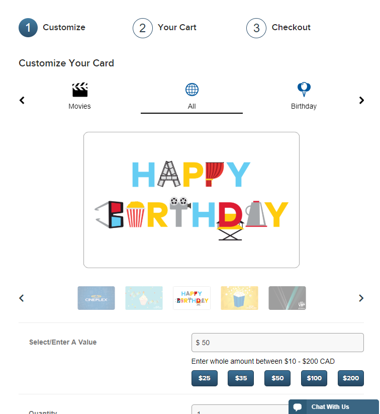
Problem: “I want to purchase a gift card, but without image descriptions, I can’t pick the appropriate design for my friend’s birthday.”
Solution: Screen readers transform and translate web content to either voice or braille for people with visual disabilities. The usability of a page with a screen reader is not dependent on the type of screen reader, but rather on the structure of the page. The most useful features are first and provide enough context for users so that they can actually interact with the page. There are several Screen Readers out there. Examples of the most commonly used are VoiceOver for Macs, NVDA and Jaws for Windows.
- Purchaser is in crisis/panic mode.
Problem: “I forgot my wife’s birthday. I need to get her a gift NOW or else I’ll never hear the end of it!”
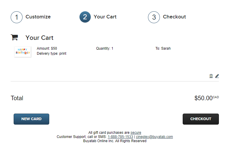
Solution: Panic can trigger “flight or fight” reflexes so having clear indicators of how to proceed are important. Examples of streamlined user interfaces are numbered steps or a simple layout to guide users through the process. When incorporating these steps, users are more likely to complete their purchase successfully and return next time.
- Purchaser has a motor disability.
Problem: “I broke my arm and can’t use a mouse properly. It’s Father’s Day and I really need to get my dad a gift.”
Solution: When only using a keyboard to navigate through a web-page, users are guided with an indicator of focus. They assist with position tracking by highlighting the current selected option. For years, UI designers have been inadvertently making the web inaccessible by removing the focus indicator when it doesn’t fit with a brand’s style. Instead of removing the guiding tool, brands should customize the indicator’s design and style it to suit the brand’s aesthetic.
It’s important to remember that these are just three examples and does not by-any-means cover the diversity of people living with disabilities or those who are in crisis. Every person is different, and their situation and circumstance vary. I encourage us all to think outside of “the box” and consider the people that don’t usually come to mind when building web applications and web sites. By not considering them, and making your product inaccessible, you are essentially losing out on potential, loyal customers and the revenue that that would bring.


